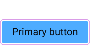
Anatomy
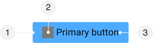
- Container
- Left icon (optional) (optional)
- Label
Default Values
| Attribute | Token | Value |
|---|---|---|
| Container | ||
| Padding (left and right) | button-padding-x-medium | 1rem |
| Padding (top and bottom) | button-padding-y-medium | 0.5rem |
| Border width | button-border-width | 1px |
| Border radius | button-radius | 3px |
| Border color | button-color-border-primary-default | #4dacff |
| Background color | button-color-background-primary-default | #4dacff |
| Label | ||
| Font family | font-control-body-1-font-family | ‘Roboto’, -apple-system, BlinkMacSystemFont, ‘Segoe UI’, Oxygen-Sans, Ubuntu, Cantarell, ‘Helvetica Neue’, sans-serif |
| Font size | font-control-body-1-font-size | 1rem |
| Font weight | font-control-body-1-font-weight | 400 |
| Line height | font-control-body-1-line-height | calc(20 / 16) |
| Letter spacing | font-control-body-1-letter-spacing | 0.005em |
| Text color | button-color-text-primary | #080c11; |
| Left icon (optional) | ||
| Dimension | button-icon-dimension | 20px |
| Margin (right) | button-icon-margin-right | 0.25rem |
| Fill color | button-icon-color-fill-primary | #080c11 |
Kinds
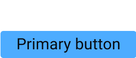
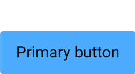
Primary
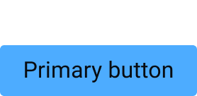
Default
| Attribute | Token | Value |
|---|---|---|
| Container | ||
| Background color | button-color-background-primary-default | #4dacff |
| Border color | button-color-border-primary-default | #4dacff |
| Label | ||
| Text color | button-color-text-primary | #080c11 |
| Left icon (optional) | ||
| Fill color | button-icon-color-fill-primary | #080c11 |
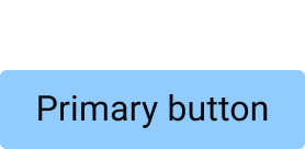
Hover
| Attribute | Token | Value |
|---|---|---|
| Container | ||
| Background color | button-color-background-primary-hover | #92cbff |
| Border color | button-color-border-primary-hover | #92cbff |
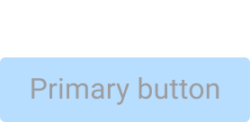
Disabled
| Attribute | Token | Value |
|---|---|---|
| Container | ||
| Opacity | opacity-disabled | 40% |
Secondary
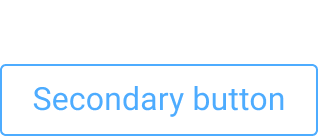
Default
| Attribute | Token | Value |
|---|---|---|
| Container | ||
| Background color | button-color-background-secondary | #ffffff00 |
| Border color | button-color-border-secondary-default | #ffffff00 |
| Label | ||
| Text color | button-color-text-secondary-default | #4dacff |
| Left icon (optional) | ||
| Fill color | button-icon-color-fill-secondary-default | #4dacff |
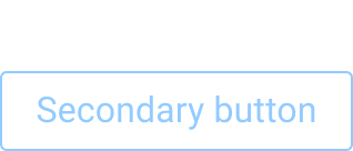
Hover
| Attribute | Token | Value |
|---|---|---|
| Container | ||
| Background color | button-color-background-secondary | #ffffff00 |
| Border color | button-color-border-secondary-hover | #ffffff00 |
| Label | ||
| Text color | button-color-text-secondary-hover | #92cbff |
| Left icon (optional) | ||
| Fill color | button-icon-color-fill-secondary-hover | #92cbff |
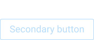
Disabled
| Attribute | Token | Value |
|---|---|---|
| Container | ||
| Opacity | opacity-disabled | 40% |
Borderless
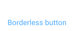
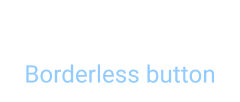
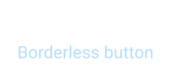
Default
| Attribute | Token | Value |
|---|---|---|
| Container | ||
| Background color | button-color-background-borderless | #ffffff00 |
| Border color | button-color-border-borderless | #ffffff00 |
| Label | ||
| Text color | button-color-text-borderless-default | #4dacff |
| Left icon (optional) | ||
| Fill color | button-icon-color-fill-borderless-default | #4dacff |
Hover
| Attribute | Token | Value |
|---|---|---|
| Label | ||
| Text color | button-color-text-borderless-hover | #92cbff |
| Left icon (optional) | ||
| Fill color | button-icon-color-fill-borderless-hover | #92cbff |
Disabled
| Attribute | Token | Value |
|---|---|---|
| Container | ||
| Opacity | opacity-disabled | 40% |
Sizes
Small
| Attribute | Token | Value |
|---|---|---|
| Container | ||
| Padding (left and right) | button-padding-x-small | 1rem |
| Padding (top and bottom) | button-padding-y-small | 0.25rem |
Medium
| Attribute | Token | Value |
|---|---|---|
| Container | ||
| Padding (left and right) | button-padding-x-medium | 1rem |
| Padding (top and bottom) | button-padding-y-medium | 0.5rem |
Large
| Attribute | Token | Value |
|---|---|---|
| Container | ||
| Padding (left and right) | button-padding-x-large | 1rem |
| Padding (top and bottom) | button-padding-y-large | 0.75rem |
Icon Only
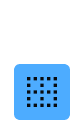
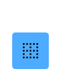
Small
| Attribute | Token | Value |
|---|---|---|
| Container | ||
| Padding (left and right) | button-padding-x-small-icon-only | 0.25rem |
| Padding (top and bottom) | button-padding-y-small-icon-only | 0.25rem |
Medium
| Attribute | Token | Value |
|---|---|---|
| Container | ||
| Padding (left and right) | button-padding-x-medium-icon-only | 0.5rem |
| Padding (top and bottom) | button-padding-y-medium-icon-only | 0.5rem |
Large
| Attribute | Token | Value |
|---|---|---|
| Container | ||
| Padding (left and right) | button-padding-x-large-icon-only | 0.75rem |
| Padding (top and bottom) | button-padding-y-large-icon-only | 0.75rem |
Focus
| Attribute | Token | Value |
|---|---|---|
| Container | ||
| Outline | focus-outline | 1px solid #da9ce7 |
| Outline Offset | focus-offset | 0.125rem |